Latest Blog
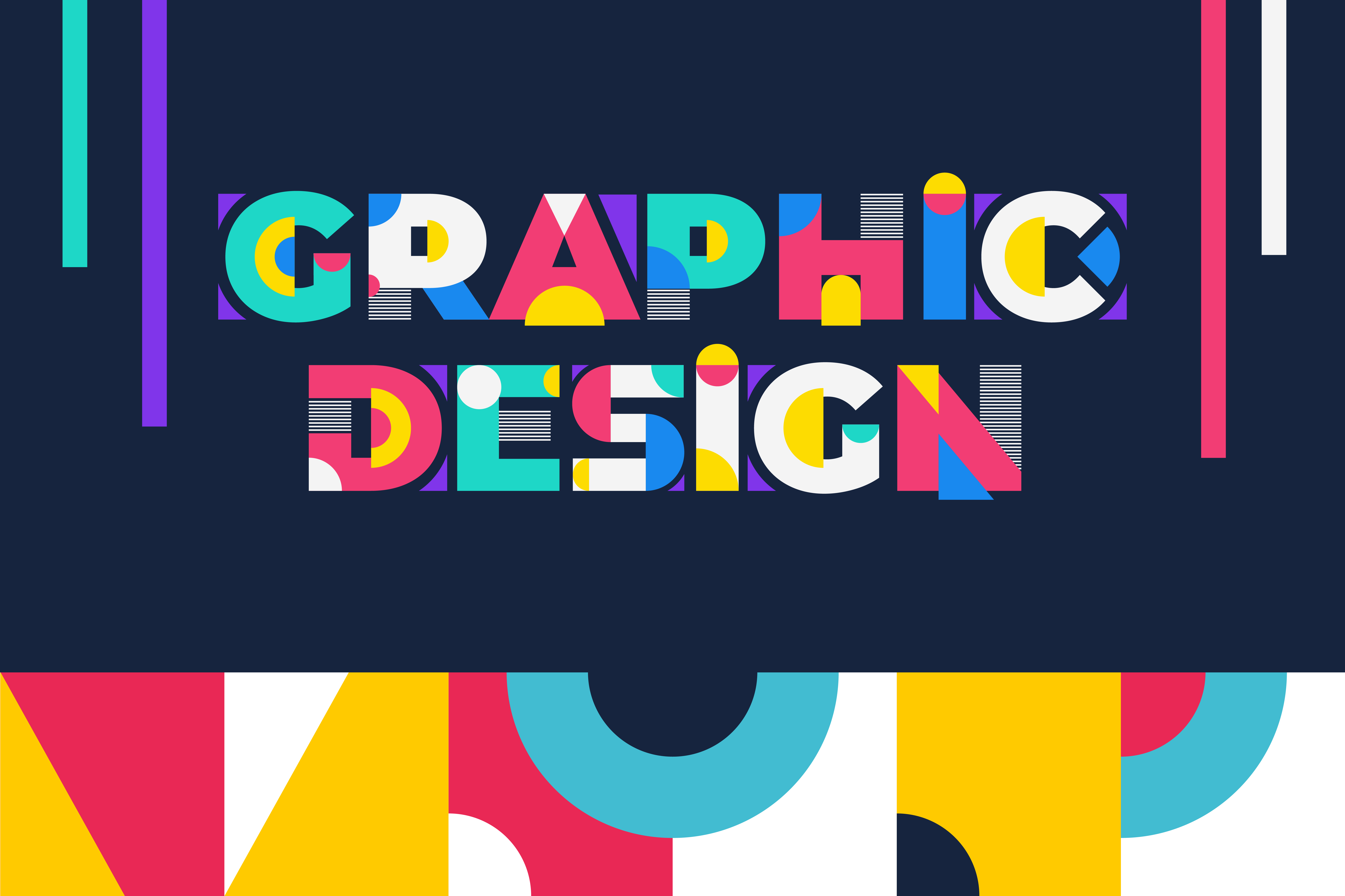
Designing a Memorable Brand: Tips and Tricks for Logo and Graphic Design - by illusiondesk
"First impressions make a lasting impact, and nothing captures attention quite like a well-designed logo and graphics. As the face of your brand, it's essential to invest in creating something memorable and visually striking. But with so many design options available, where do you even begin? Fear not! In this blog post, we'll be sharing expert tips and tricks on how to create a standout brand through effective logos and graphic design. Get ready to leave your mark on the world!"
Introduction to Logo and Graphic Design
When it comes to creating a memorable brand, logo and graphic design are key. Your logo is often the first thing potential customers will see, so it's important to make sure it's effective in conveying who you are and what you do. Meanwhile, good graphic design can help your brand stand out from the competition and leave a lasting impression.With that in mind, here are some tips and tricks for designing a logo and graphics that will help your brand make a lasting impression:
1. Keep it simple. A complex logo or busy graphic design can be difficult to remember or understand. When it comes to your logo, less is often more. Stick to one or two colors and limit the number of elements in your design.
2. Make sure it's relevant. Your logo and graphics should be relevant to your industry or target audience. If you're a company that sells outdoor gear, for example, using nature-themed imagery in your designs can help communicate what you do at a glance.
3. Use high-quality visuals. Low-quality visuals can make your brand look unprofessional or untrustworthy. Make sure the images you use in your designs are high-resolution and of good quality.
4. Be consistent. Consistency is key when it comes to branding. Once you've designed your logo and other graphics, use them consistently across all of your marketing materials - from your website to your business cards - so customers always know they're
Benefits of Having a Professional Design
When it comes to creating a brand that customers will remember, professional design is key. Here are just a few of the benefits of working with a professional designer on your logo and other graphic elements:1. A professional designer has the skills and experience needed to create a high-quality, polished final product.
2. With extensive training in typography, color theory, and other design principles, a professional designer can help ensure that your logo and other visuals are effective and communicate the right message to your target audience.
3. A professional can also help you stay ahead of current trends in graphic design, ensuring that your brand looks modern and relevant.
4. working with a professional designer also allows you to tap into their network of industry contacts, which can be helpful when it comes time to print or distribute your marketing materials
Basic Principles of Good Brand Design
The basic principles of good brand design are simple: keep it clean, make it memorable, and make it relevant to your audience. But the devil is in the details, and there are a few key things to keep in mind when you're designing your brand.First, simplicity is key. A good brand should be easy to understand and recognize. That means using simple shapes, colors, and fonts that can be easily reproduced across all mediums.
Second, your brand should be memorable. That means choosing a design that will stand out from the crowd and be remembered long after someone sees it. Think about using strong visual elements like images or symbols that can be easily associated with your brand.
Your brand should be relevant to your audience. It should reflect the values of your company and speak to the needs of your target market. When you're designing your brand, think about who you want to reach and what you want them to think of when they see your logo or hear your name.
Examples of Effective Logos and Graphics
A great logo should be simple, memorable, and easy to read. An effective graphic is one that is well-designed and catches the eye. Here are some examples of amazing logos and graphics that have been used effectively:The Nike swoosh is one of the most recognizable logos in the world. It's simple, yet effective and has become synonymous with the Nike brand.
The Coca-Cola logo is another iconic design that is immediately recognizable. The red and white colors are synonymous with the Coke brand, and the unique font is easy to read and remember.
The FedEx logo is clever and easy to remember. The use of negative space creates an arrow shape between the "E" and "X", which represents speed and efficiency - two key attributes of the FedEx brand.
The Grumpy Cat meme became popular for its hilariously grumpy facial expression. The cat's face was turned into a viral sensation, appearing on everything from t-shirts to coffee mugs. This just goes to show that even a non-traditional logo can be effective if it's done right!
Tips for Designing Your Logo and Graphics
1. Keep it simple - don't try to incorporate too many elements into your logo or graphics. A simpler design will be more memorable and easier for people to recognize.2. Use strong, contrasting colors - this will help your logo or graphics stand out and be more easily noticed.
3. Use clean, stylish fonts - again, this will help with the recognition and recall of your brand.
4. Make sure your logo or graphic is relevant to your brand - it should represent what you do and who you are as a company.
5. Avoid using clichéd images or symbols - these are overused and often not very original or memorable.
6. Have someone else take a look at your design - get feedback from others to see if they think it's effective and captures the essence of your brand.
Basics of Color Theory
Color theory is the study of how colors interact with one another. It includes the study of how certain colors can be used to create desired effects, and how different color combinations can be used to create harmony or tension.There are three basic principles of color theory:
1) The color wheel is the basis for understanding how colors relate to one another. The primary colors (red, yellow, and blue) are located at equal intervals around the wheel. The secondary colors (orange, green, and purple) are created by mixing two primary colors together. The tertiary colors (red-orange, yellow-orange, yellow-green, blue-green, blue-purple, and red-purple) are created by mixing a primary color with a secondary color.
2) Colors can be described in terms of hue (the name of the color), value (how light or dark the color is), and saturation (how intense the color is).
3) There are four basic color schemes: monochromatic (using only one hue), complementary (using two hues that are opposite each other on the color wheel), analogous (using three hues that are next to each other on the color wheel), and triadic (using three hues that are equally spaced around the color wheel).
Strategies for Managing Multiple Design Assets
1. Create a centralized repository for all your brand assets. This way, you can easily access and update any file when needed.2. Develop a consistent naming convention for all your files. This will help keep everything organized and make it easier to find the right file when you need it.
3.backer-optinRegularly review and update your assets. This will ensure that your designs are up-to-date and relevant to your brand.
4. Make use of automated tools to help manage your files. There are various software programs available that can help streamline the design process and make asset management simpler.
How to Test & Iterate the Brand's Look
There are a few key ways to test and iterate the brand's look once you have a rough draft. First, consider surveying your target market or audience to get feedback on the proposed design. Second, think about how the design will look across different mediums and in different contexts - will it still be recognizable and effective? Pay attention to any negative feedback or pushback you receive - this can be a helpful signal that something isn't quite working and needs to be tweaked.Once you have gathered this feedback, it's time to make changes and iterations to the design. Be sure to keep the overall goals of the branding in mind, and try not to stray too far from the original vision. Small adjustments can often make a big impact, so don't be afraid to experiment. With some trial and error, you'll eventually land on a final design that feels true to the brand and resonates with its audience.


